| CONTENTS |
In the previous chapter, we discussed a number of concepts, including how Java's user interface facility is put together and how the larger pieces work. You should understand what components and containers are, how you use them to create a display, what events are, how components use them to communicate with the rest of your application, and what layout managers are.
Now that we're through with the general concepts and background, we'll get to the fun stuff: how to do things with Swing. We will cover most of the components that the Swing package supplies, how to use these components in applets and applications, and how to build your own components. We will have lots of code and lots of pretty examples to look at.
There's more material than fits in a single chapter. In this chapter, we'll cover all the basic user interface components. In the next chapter, we'll cover some of the more involved topics: text components, trees, tables, and creating your own components.
We'll start with the simplest components: buttons and labels. Frankly, there isn't much to say about them. If you've seen one button, you've seen them all, and you've already seen buttons in the applications in Chapter 2 (HelloJava3 and HelloJava4). A button generates an ActionEvent when the user presses it. To receive these events, your program registers an ActionListener , which must implement the actionPerformed() method. The argument passed to actionPerformed() is the event itself.
There's one more thing worth saying about buttons, which applies to any component that generates an action event. Java lets us specify an "action command" string for buttons (and other components, like menu items, that can generate action events). The action command is less interesting than it sounds. It is just a String that serves to identify the component that sent the event. By default, the action command of a JButton is the same as its label; it is included in action events, so you can use it to figure out which button an event came from.
To get the action command from an action event, call the event's getAction-Command() method. The following code checks whether the user pressed the button labeled Yes:
public void actionPerformed(ActionEvent e){
    if (e.getActionCommand( ).equals("Yes") {
        //the user pressed "Yes"; do something
        ...
    }
}
Yes is a string, not a command per se. You can change the action command by calling the button's setActionCommand() method. The following code changes button myButton's action command to "confirm":
myButton.setActionCommand("confirm");
It's a good idea to get used to setting action commands explicitly; this helps to prevent your code from breaking when you or some other developer " internationalizes" it or otherwise changes the button's label. If you rely on the button's label, your code stops working as soon as that label changes; a French user might see the label Oui rather than Yes. By setting the action command, you eliminate one source of bugs; for example, the button myButton in the previous example always generates the action command confirm, regardless of what its label says.
Swing buttons can have an image in addition to a label. The JButton class includes constructors that accept an Icon object, which knows how to draw itself. You can create buttons with captions, images, or both. A handy class called ImageIcon takes care of loading an image for you and can be used to add an image to a button. The following example shows how this works:
//file: PictureButton.java
import java.awt.*;
import java.awt.event.*;
import javax.swing.*;

public class PictureButton {
  public static void main(String[] args)
  {
    JFrame frame = new JFrame(  );
    Icon icon = new ImageIcon("rhino.gif");
    JButton button = new JButton(icon);

    button.addActionListener( new ActionListener(  ) {
      public void actionPerformed(ActionEvent ae) {
        System.out.println("Urp!");
      }
    });

    frame.getContentPane(  ).add( button );
    frame.pack(  );
    frame.setDefaultCloseOperation( JFrame.EXIT_ON_CLOSE );
    frame.setVisible(true);
  }
}
The example creates an ImageIcon from the rhino.gif file. Then a JButton is created from the ImageIcon. The whole thing is displayed in a JFrame. This example also shows the idiom of using an anonymous inner class as an ActionListener.
There's even less to be said about JLabel components. They're just text strings or images housed in a component. There aren't any special events associated with labels; about all you can do is specify the text's alignment, which controls the position of the text within the label's display area. As with buttons, JLabels can be created with Icons if you want to create a picture label. The following code creates some labels with different options:
// default alignment (CENTER)
JLabel label1 = new JLabel("Lions");

// left aligned
JLabel label2 = new JLabel("Tigers", SwingConstants.LEFT);

//label with no text, default alignment
JLabel label3 = new JLabel( );

// create image icon
Icon icon = new ImageIcon("rhino.gif");

// create image label
JLabel label4 = new JLabel(icon);

// assigning text to label3
label3.setText("and Bears");

// set alignment
label3.setHorizontalAlignment(SwingConstants.RIGHT);
The alignment constants are defined in the SwingConstants interface.
Now we've built several labels, using a variety of constructors and several of the class's methods. To display the labels, just add them to a container by calling the container's add() method.
You can set other label characteristics, such as changing their font or color, using the methods of the Component class, JLabel's distant ancestor. For example, you can call setFont() and setColor() on a label, as with any other component.
Given that labels are so simple, why do we need them at all? Why not just draw a text string directly on the container object? Remember that a JLabel is a JComponent. That's important; it means that labels have the normal complement of methods for setting fonts and colors that we mentioned earlier as well as the ability to be persistently and sensibly managed by a layout manager. Therefore, they're much more flexible than a text string drawn at an absolute location within a container. Speaking of layouts—if you use the setText() method to change the text of your label, the label's preferred size may change. But the label's container automatically lays out its components when this happens, so you don't have to worry about it.
Swing can interpret HTML-formatted text in JLabel and JButton labels. The following example shows how to create a button with some HTML-formatted text:
JButton button = new JButton(
  "<html>"
  + "S<font size=-1>MALL<font size=+0> "
  + "C<font size=-1>APITALS");
Older versions of Java may not render complex HTML very well. But as of 1.4, most basic HTML features are supported, including crazy things such as images and tables.
Figure 16-1 uses an HTML table to arrange its text.

Figure 16-2 uses an HTML image tag to display an image.
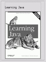
The code for the two figures looks like this:
String html=
    "<html><table border=1>"
    +"<tr><td>One</td><td>Two</td></tr>"
    +"<tr><td>Three</td><td>Four</td></tr>"
    +"</table>";
JButton button = new JButton(html);

String html2=
    "<html><h3>Learning Java</h3>"
    +"<img src=\"http://www.ora.com/catalog/covers/learnjava2.gif\">";
Jbutton button2 = new JButton(html2);
A checkbox is a labeled toggle switch. Each time the user clicks it, its state toggles between checked and unchecked. Swing implements the checkbox as a special kind of button. Radio buttons are similar to checkboxes, but they are normally used in groups. Clicking on one radio button in the group automatically turns the others off. They are named for the mechanical preset buttons on old car radios (like some of us had in high school).
Checkboxes and radio buttons are represented by instances of JCheckBox and JRadioButton, respectively. Radio buttons can be tethered together using an instance of another class called ButtonGroup . By now you're probably well into the swing of things (no pun intended) and could easily master these classes on your own. We'll use an example to illustrate a different way of dealing with the state of components and to show off a few more things about containers.
A JCheckBox sends ItemEvent s when it's pushed. Because a checkbox is a kind of button, it also fires ActionEvents when checked. For something like a checkbox, we might want to be lazy and check on the state of the buttons only at some later time, such as when the user commits an action. For example, when filling out a form you may only care about the user's choices when the submit button is pressed.
The next application, DriveThrough, lets us check off selections on a fast food menu, as shown in Figure 16-3.
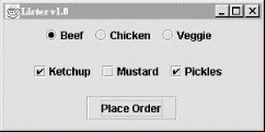
DriveThrough prints the results when we press the Place Order button. Therefore, we can ignore all the events generated by our checkboxes and radio buttons and listen only for the action events generated by the regular button.
//file: DriveThrough.java
import java.awt.*;
import java.awt.event.*;
import javax.swing.*;

public class DriveThrough
{
  public static void main(String[] args) {
    JFrame frame = new JFrame("Lister v1.0");

    JPanel entreePanel = new JPanel(  );
    final ButtonGroup entreeGroup = new ButtonGroup(  );
    JRadioButton radioButton;
    entreePanel.add(radioButton = new JRadioButton("Beef"));
    radioButton.setActionCommand("Beef");
    entreeGroup.add(radioButton);
    entreePanel.add(radioButton = new JRadioButton("Chicken"));
    radioButton.setActionCommand("Chicken");
    entreeGroup.add(radioButton);
    entreePanel.add(radioButton = new JRadioButton("Veggie", true));
    radioButton.setActionCommand("Veggie");
    entreeGroup.add(radioButton);

    final JPanel condimentsPanel = new JPanel(  );
    condimentsPanel.add(new JCheckBox("Ketchup"));
    condimentsPanel.add(new JCheckBox("Mustard"));
    condimentsPanel.add(new JCheckBox("Pickles"));

    JPanel orderPanel = new JPanel(  );
    JButton orderButton = new JButton("Place Order");
    orderPanel.add(orderButton);

    Container content = frame.getContentPane(  );
    content.setLayout(new GridLayout(3, 1));
    content.add(entreePanel);
    content.add(condimentsPanel);
    content.add(orderPanel);

    orderButton.addActionListener(new ActionListener(  ) {
      public void actionPerformed(ActionEvent ae) {
        String entree =
          entreeGroup.getSelection(  ).getActionCommand(  );
        System.out.println(entree + " sandwich");
        Component[] components = condimentsPanel.getComponents(  );
        for (int i = 0; i < components.length; i++) {
          JCheckBox cb = (JCheckBox)components[i];
          if (cb.isSelected(  ))
            System.out.println("With " + cb.getText(  ));
        }
      }
    });

    frame.setDefaultCloseOperation( JFrame.EXIT_ON_CLOSE );
    frame.setSize(300, 150);
    frame.setVisible(true);
  }
}
DriveThrough lays out three panels. The radio buttons in the entreePanel are tied together through a ButtonGroup object. We add() the buttons to a ButtonGroup to make them mutually exclusive. The ButtonGroup object is an odd animal. One might expect it to be a container or a component, but it isn't; it's simply a helper object that allows only one RadioButton to be selected at a time.
In this example, the button group forces you to choose a beef, chicken, or veggie entree, but not more than one. The condiment choices, which are JCheckBoxes, aren't in a button group, so you can request any combination of ketchup, mustard, and pickles on your sandwich.
When the Place Order button is pushed, we receive an ActionEvent in the actionPerformed() method of our inner ActionListener. At this point, we gather the information in the radio buttons and checkboxes and print it. actionPerformed() simply reads the state of the various buttons. We could have saved references to the buttons in a number of ways; this example demonstrates two. First, we find out which entree was selected. To do so, we call the ButtonGroup's getSelection() method. This returns a ButtonModel, upon which we immediately call getActionCommand(). This returns the action command as we set it when we created the radio buttons. The action commands for the buttons are the entrée names, which is exactly what we need.
To find which condiments were selected, we use a more complicated procedure. The problem is that condiments aren't mutually exclusive, so we don't have the convenience of a ButtonGroup. Instead, we ask the condiments JPanel for a list of its components. The getComponents() method returns an array of references to the container's child components. We'll use this to loop over the components and print the results. We cast each element of the array back to JCheckBox and call its isSelected() method to see if the checkbox is on or off. If we were dealing with different types of components in the array, we could determine each component's type with the instanceof operator. Or, more generally, we could maintain references to the elements of our form in some explicit way (a map by name,perhaps).
JLists and JComboBoxes are a step up on the evolutionary chain from JButtons and JLabels. Lists let the user choose from a group of alternatives. They can be configured to force a single selection or allow multiple choices. Usually, only a small group of choices is displayed at a time; a scrollbar lets the user move to the choices that aren't visible. The user can select an item by clicking on it. She can expand the selection to a range of items by holding down Shift and clicking on another item. To make discontinuous selections, the user can hold down the Control key instead of the Shift key (on a Mac, this is the Command key).
A combo box is a cross-breed between a text field and a list. It displays a single line of text (possibly with an image) and a downward pointing arrow on one side. If you click on the arrow, the combo box opens up and displays a list of choices. You can select a single choice by clicking on it. After a selection is made, the combo box closes up; the list disappears, and the new selection is shown in the text field.
Like other components in Swing, lists and combo boxes have data models that are distinct from visual components. The list also has a selection model that controls how selections may be made on the list data.
Lists and combo boxes are similar because they have similar data models. Each is simply an array of acceptable choices. This similarity is reflected in Swing, of course: the type of a JComboBox's data model is a subclass of the type used for a JList's data model. The next example demonstrates this relationship.
The following example creates a window with a combo box, a list, and a button. The combo box and the list use the same data model. When you press the button, the program writes out the current set of selected items in the list (see Figure 16-4).
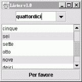
Here's the code for the example:
//file: Lister.java
import java.awt.*;
import java.awt.event.*;
import javax.swing.*;

public class Lister {
  public static void main(String[] args) {
    JFrame frame = new JFrame("Lister v1.0");

    // create a combo box
    String [] items = { "uno", "due", "tre", "quattro", "cinque",
                        "sei", "sette", "otto", "nove", "deici",
                        "undici", "dodici" };
    JComboBox comboBox = new JComboBox(items);
    comboBox.setEditable(true);

    // create a list with the same data model
    final JList list = new JList(comboBox.getModel( ));

    // create a button; when it's pressed, print out
    // the selection in the list
    JButton button = new JButton("Per favore");
    button.addActionListener(new ActionListener( ) {
      public void actionPerformed(ActionEvent ae) {
        Object[] selection = list.getSelectedValues( );
        System.out.println("-----");
        for (int i = 0; i < selection.length; i++)
          System.out.println(selection[i]);
      }
    });

    // put the controls the content pane
    Container c = frame.getContentPane( );
    JPanel comboPanel = new JPanel( );
    comboPanel.add(comboBox);
    c.add(comboPanel, BorderLayout.NORTH);
    c.add(new JScrollPane(list), BorderLayout.CENTER);
    c.add(button, BorderLayout.SOUTH);

    frame.setSize(200, 200);
    frame.setDefaultCloseOperation( JFrame.EXIT_ON_CLOSE );
    frame.setVisible(true);
  }
}
The combo box is created from an array of strings. This is a convenience—behind the scenes, the JComboBox constructor creates a data model from the strings you supply and sets the JComboBox to use that data model. The list is created using the data model of the combo box. This works because JList expects to use a ListModel for its data model, and the ComboBoxModel used by the JComboBox is a subclass of ListModel.
The button's action event handler simply prints out the selected items in the list, which are retrieved with a call to getSelectedValues(). This method actually returns an object array, not a string array. List and combo box items, like many other things in Swing, are not limited to text. You can use images, drawings, or some combination of text and images.
You might expect that selecting one item in the combo box would select the same item in the list. In Swing components, selection is controlled by a selection model. The combo box and the list have distinct selection models; after all, you can select only one item from the combo box while it's possible to select multiple items from the list. Thus, while the two components share a data model, they have separate selection models.
We've made the combo box editable. By default, it would not be editable: the user could choose only one item in the drop-down list. With an editable combo box, the user can type in a selection, as if it were a text field. Noneditable combo boxes are useful if you just want to offer a limited set of choices; editable combo boxes are handy when you want to accept any input but offer some common choices.
There's a great class tucked away in the last example that deserves some recognition. It's JScrollPane. In Lister, you'll notice we created one when we added the List to the main window. JScrollPane simply wraps itself around another Component and provides scrollbars as necessary. The scrollbars show up if the contained Component's preferred size (as returned by getPreferredSize() ) is greater than the size of the JScrollPane itself. In the previous example, the scrollbars show up whenever the size of the List exceeds the available space.
You can use JScrollPane to wrap any Component, including components with drawings or images or complex user interface panels. We'll discuss JScrollPane in more detail later in this chapter, and we'll use it frequently with the text components in Chapter 17.
Jlist and JComboBox are two ways to let the user choose from a set of values. A JComboBox has added flexibility when it is made editable, but in general both of these components are limited in that they can only prompt the user from a fixed set of choices. In Java 1.4, Swing added a new component, JSpinner, which is useful for large or open-ended sequences of values such as numbers or dates. The JSpinner is a cousin of the JComboBox; it displays a value in a field, but instead of providing a drop-down list of choices, it gives the user a small pair of up and down arrows for moving over a range of values (see Figure 16-5). Like the combo box, a JSpinner can also be made editable, allowing the user to type a valid value directly into the field.

Swing provides three basic types of Spinners, represented by three different data models for the JSpinner component: SpinnerListModel , SpinnerNumberModel, and SpinnerDateModel.
The SpinnerListModel acts like a combo box, specifying a fixed set of objects:
String [] options = new String [] { "small", "medium", "large", "huge" };
SpinnerListModel model = new SpinnerListModel( options );
JSpinner spinner = new JSpinner( model );
You can retrieve the current value from the model at any time:
String value = (String)model.getValue( );
Alternatively, you can register a ChangeListener to receive updates as the user changes values. With a SpinnerListModel, if the spinner is editable and the user enters a value directly, it is validated against the set of choices before being accepted. This behavior is a little different from the other types of SpinnerModels, which when editable accept any valid value of the correct type (e.g., a number or date).
The SpinnerNumberModel displays numeric values. It can be configured with initial, minimum, and maximum values:
double initial=5.0, min=0.0, max=10.0, increment=0.1;
SpinnerNumberModel model =
    new SpinnerNumberModel( initial, min, max, increment );
JSpinner spinner = new JSpinner(model);
Here we have constructed a spinner with an initial value of 5.0 that allows the user to change the value to between 0 and 10.0 in increments of 0.1. The SpinnerNumberModel getNumber() method retrieves the current value.
Perhaps the most interesting feature of the JSpinner is the SpinnerDateModel, which allows the user to choose calendar dates by moving in specified increments of time. The SpinnerDateModel accepts a range, such as the SpinnerNumberModel, but the values are Date objects, and the increment is a java.util.Calendar constant field such as Calendar.DAY, Calendar.WEEK, and so on. The following example, DateSelector, creates a JSpinner showing the current date and time. It allows the user to change the date in increments of one week, over a range of one year (six months forward or back). A ChangeListener is registered with the model to display the values as they are modified:
import java.awt.*;
import java.awt.event.*;
import javax.swing.*;
import javax.swing.event.*;
import java.util.*;

public class DateSelector {
  public static void main(String[] args)
  {
    JFrame frame = new JFrame("DateSelector v1.0");

    Calendar now = Calendar.getInstance( );
    Calendar earliest = (Calendar)now.clone( );
    earliest.add( Calendar.MONTH, -6 );
    Calendar latest = (Calendar)now.clone( );
    latest.add( Calendar.MONTH, 6 );
    SpinnerModel model = new SpinnerDateModel(
        now.getTime( ), earliest.getTime( ), latest.getTime( ),
        Calendar.WEEK_OF_YEAR);
    final JSpinner spinner = new JSpinner(model);

    model.addChangeListener( new ChangeListener( ) {
        public void stateChanged(ChangeEvent e) {
            System.out.println( ((SpinnerDateModel)e.getSource( )).getDate( ) );
        }
    } );

    frame.getContentPane( ).add( "North", new JLabel("Choose a week") );
    frame.getContentPane( ).add( "Center", spinner );
    frame.pack( );
    frame.setDefaultCloseOperation( JFrame.EXIT_ON_CLOSE );
    frame.setVisible(true);
  }
}
As we said, the SpinnerCalendarModel acts just like the SpinnerNumberModel, except that it works with Date objects and uses the special Calendar constants as increments. To create dates, we construct a Calendar object for the correct time and use its getTime() method. In this example, we used the Calendar's add() method to set the minimum and maximum values six months in each direction. Table 16-1 shows values for increments in the Calendar.
|
Field value |
Increment |
|---|---|
|
Calendar.MILLISECOND |
One millisecond |
|
Calendar.SECOND |
One second |
|
Calendar.MINUTE |
One minute |
|
Calendar.HOUR, Calendar.HOUR_OF_DAY |
One hour |
|
Calendar.AM_PM |
A.M. or P.M. |
|
Calendar.DAY_OF_WEEK, Calendar.DAY_OF_MONTH, Calendar.DAY_OF_YEAR |
One day |
|
Calendar.MONTH |
One month |
|
Calendar.YEAR |
One year |
|
Calendar.ERA |
B.C. or A.D. in the Gregorian Calendar |
The SpinnerDateModel uses the Calendar add() method with a value of 1 or -1 and the corresponding constant value to increment or decrement the value. Increments of 1 have the same effect on several of the constants, as indicated in Table 16-1.
Any Swing component can have a decorative border. JComponent includes a method called setBorder() ; all you have to do is call setBorder(), passing it an appropriate implementation of the Border interface.
Swing provides many useful Border implementations in the javax.swing.border package. You could create an instance of one of these classes and pass it to a component's setBorder() method, but there's an even simpler technique.
The BorderFactory class creates any kind of border for you using static "factory" methods. Creating and setting a component's border, then, is simple:
JLabel labelTwo = new JLabel("I have an etched border.");
labelTwo.setBorder(BorderFactory.createEtchedBorder( ));
Every component has a setBorder() method, from simple labels and buttons right up to the fancy text and table components we cover in Chapter 17.
BorderFactory is convenient, but it does not offer every option of every border type. For example, if you want to create a raised EtchedBorder instead of the default lowered border, you'll need to use EtchedBorder's constructor, like this:
JLabel labelTwo = new JLabel("I have a raised etched border.");
labelTwo.setBorder( new EtchedBorder(EtchedBorder.RAISED) );
The Border implementation classes are listed and briefly described here:
This border draws raised or lowered beveled edges, giving an illusion of depth.
This border is similar to BevelBorder, but thinner.
Doesn't do any drawing, but does take up space. You can use it to give a component a little breathing room in a crowded user interface.
A lowered etched border gives the appearance of a rectangle that has been chiseled into a piece of stone. A raised etched border looks like it is standing out from the surface of the screen.
Draws a simple rectangle around a component. You can specify the color and width of the line in LineBorder's constructor.
A souped-up version of LineBorder. You can create a MatteBorder with a certain color and specify the size of the border on the left, top, right, and bottom of the component. MatteBorder also allows you to pass in an Icon that will be used to draw the border. This could be an image (ImageIcon) or any other implementation of the Icon interface.
A regular border with a title. TitledBorder doesn't actually draw a border; it just draws a title in conjunction with another border object. You can specify the locations of the title, its justification, and its font. This border type is particularly useful for grouping different sets of controls in a complicated interface.
A border that contains two other borders. This is especially handy if you want to enclose a component in an EmptyBorder and then put something decorative around it, such as an EtchedBorder or a MatteBorder.
The following example shows off some different border types. It's only a sampler, though; many more border types are available. Furthermore, the example only encloses labels with borders. You can put a border around any component in Swing. The example is shown in Figure 16-6; the source code follows.
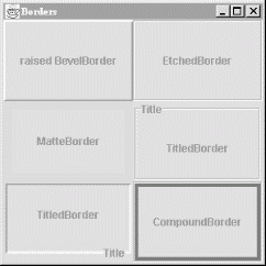
//file: Borders.java
import java.awt.*;
import java.awt.event.*;
import javax.swing.*;
import javax.swing.border.*;

public class Borders {
  public static void main(String[] args) {
    // create a JFrame to hold everything
    JFrame frame = new JFrame("Borders");

    // Create labels with borders.
    int center = SwingConstants.CENTER;
    JLabel labelOne = new JLabel("raised BevelBorder", center);
    labelOne.setBorder(
        BorderFactory.createBevelBorder(BevelBorder.RAISED));
    JLabel labelTwo = new JLabel("EtchedBorder", center);
    labelTwo.setBorder(BorderFactory.createEtchedBorder(  ));
    JLabel labelThree = new JLabel("MatteBorder", center);
    labelThree.setBorder(
        BorderFactory.createMatteBorder(10, 10, 10, 10, Color.pink));
    JLabel labelFour = new JLabel("TitledBorder", center);
    Border etch = BorderFactory.createEtchedBorder(  );
    labelFour.setBorder(
        BorderFactory.createTitledBorder(etch, "Title"));
    JLabel labelFive = new JLabel("TitledBorder", center);
    Border low = BorderFactory.createLoweredBevelBorder(  );
    labelFive.setBorder(
        BorderFactory.createTitledBorder(low, "Title",
        TitledBorder.RIGHT, TitledBorder.BOTTOM));
    JLabel labelSix = new JLabel("CompoundBorder", center);
    Border one = BorderFactory.createEtchedBorder(  );
    Border two =
        BorderFactory.createMatteBorder(4, 4, 4, 4, Color.blue);
    labelSix.setBorder(BorderFactory.createCompoundBorder(one, two));

    // add components to the content pane
    Container c = f.getContentPane(  );
    c.setLayout(new GridLayout(3, 2));
    c.add(labelOne);
    c.add(labelTwo);
    c.add(labelThree);
    c.add(labelFour);
    c.add(labelFive);
    c.add(labelSix);

    frame.setDefaultCloseOperation( JFrame.EXIT_ON_CLOSE );
    frame.pack( );
    frame.setVisible(true);
  }
}
A JMenu is a standard pull-down menu with a fixed name. Menus can hold other menus as submenu items, enabling you to implement complex menu structures. In Swing, menus are first-class components, just like everything else. You can place them wherever a component would go. Another class, JMenuBar, holds menus in a horizontal bar. Menu bars are real components, too, so you can place them wherever you want in a container: top, bottom, or middle. But in the middle of a container, it usually makes more sense to use a JComboBox rather than some kind of menu.
Menu items may have associated images and shortcut keys; there are even menu items that look like checkboxes and radio buttons. Menu items are really a kind of button. Like buttons, menu items fire action events when they are selected. You can respond to menu items by registering action listeners with them.
There are two ways to use the keyboard with menus. The first is called mnemonics. A mnemonic is one character in the menu name. If you hold down the Alt key and type a menu's mnemonic, the menu drops down, just as if you had clicked on it with the mouse. Menu items may also have mnemonics. Once a menu is dropped down, you can select individual items in the same way.
Menu items may also have accelerators. An accelerator is a key combination that selects the menu item, whether or not the menu that contains it is showing. A common example is the accelerator Ctrl-C, which is frequently used as a shortcut for the Copy item in the Edit menu.
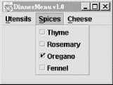
The next example demonstrates several different features of menus. It creates a menu bar with three different menus. The first, Utensils, contains several menu items, a submenu, a separator, and a Quit item that includes both a mnemonic and an accelerator. The second menu, Spices, contains menu items that look and act like checkboxes. Finally, the Cheese menu demonstrates radio button menu items.
The application is shown in Figure 16-7 with one of its menus dropped down. Choosing Quit from the Utensils menu (or pressing Ctrl-Q) removes the window.
//file: DinnerMenu.java
import java.awt.*;
import java.awt.event.*;
import javax.swing.*;

public class DinnerMenu
{
  public static void main(String[] args) {
    JFrame frame = new JFrame("Dinner Menu");

    // create the Utensils menu
    JMenu utensils = new JMenu("Utensils");
    utensils.setMnemonic(KeyEvent.VK_U);
    utensils.add(new JMenuItem("Fork"));
    utensils.add(new JMenuItem("Knife"));
    utensils.add(new JMenuItem("Spoon"));
    JMenu hybrid = new JMenu("Hybrid");
    hybrid.add(new JMenuItem("Spork"));
    hybrid.add(new JMenuItem("Spife"));
    hybrid.add(new JMenuItem("Knork"));
    utensils.add(hybrid);
    utensils.addSeparator(  );

    // do some fancy stuff with the Quit item
    JMenuItem quitItem = new JMenuItem("Quit");
    quitItem.setMnemonic(KeyEvent.VK_Q);
    quitItem.setAccelerator(
        KeyStroke.getKeyStroke(KeyEvent.VK_Q, Event.CTRL_MASK));
    quitItem.addActionListener(new ActionListener(  ) {
      public void actionPerformed(ActionEvent e) { System.exit(0); }
    });
    utensils.add(quitItem);

    // create the Spices menu
    JMenu spices = new JMenu("Spices");
    spices.setMnemonic(KeyEvent.VK_S);
    spices.add(new JCheckBoxMenuItem("Thyme"));
    spices.add(new JCheckBoxMenuItem("Rosemary"));
    spices.add(new JCheckBoxMenuItem("Oregano", true));
    spices.add(new JCheckBoxMenuItem("Fennel"));

    // create the Cheese menu
    JMenu cheese = new JMenu("Cheese");
    cheese.setMnemonic(KeyEvent.VK_C);
    ButtonGroup group = new ButtonGroup(  );
    JRadioButtonMenuItem rbmi;
    rbmi = new JRadioButtonMenuItem("Regular", true);
    group.add(rbmi);
    cheese.add(rbmi);
    rbmi = new JRadioButtonMenuItem("Extra");
    group.add(rbmi);
    cheese.add(rbmi);
    rbmi = new JRadioButtonMenuItem("Blue");
    group.add(rbmi);
    cheese.add(rbmi);

    // create a menu bar and use it in this JFrame
    JMenuBar menuBar = new JMenuBar(  );
    menuBar.add(utensils);
    menuBar.add(spices);
    menuBar.add(cheese);
    frame.setJMenuBar(menuBar);

    frame.setDefaultCloseOperation( JFrame.EXIT_ON_CLOSE );
    frame.setSize(200,200);
    frame.setVisible(true);
  }
}
Yes, we know. Quit doesn't belong in the Utensils menu. If it's driving you crazy, you can go back and add a File menu as an exercise when we're through.
Creating menus is pretty simple work. You create a JMenu object, specifying the menu's title. Like the text of JButtons and JLabels, menu labels can contain simple HTML. Then you just add JMenuItems to the JMenu. You can also add JMenus to a JMenu; they show up as submenus. This is shown in the creation of the Utensils menu:
JMenu utensils = new JMenu("Utensils");
utensils.setMnemonic(KeyEvent.VK_U);
utensils.add(new JMenuItem("Fork"));
utensils.add(new JMenuItem("Knife"));
utensils.add(new JMenuItem("Spoon"));
JMenu hybrid = new JMenu("Hybrid");
hybrid.add(new JMenuItem("Spork"));
hybrid.add(new JMenuItem("Spife"));
hybrid.add(new JMenuItem("Knork"));
utensils.add(hybrid);
In the second line, we set the mnemonic for this menu using a constant defined in the KeyEvent class.
You can add those pretty separator lines with a single call:
utensils.addSeparator( );
The Quit menu item has some bells and whistles we should explain. First, we create the menu item and set its mnemonic, just as we did before for the Utensils menu:
JMenuItem quitItem = new JMenuItem("Quit");
quitItem.setMnemonic(KeyEvent.VK_Q);
Now we want to create an accelerator for the menu item. We do this with the help of a class called KeyStroke:
quitItem.setAccelerator(
    KeyStroke.getKeyStroke(KeyEvent.VK_Q, Event.CTRL_MASK));
Finally, to actually do something in response to the menu item, we register an action listener:
quitItem.addActionListener(new ActionListener( ) {
    public void actionPerformed(ActionEvent e) { System.exit(0); }
});
Our action listener exits the application when the Quit item is selected.
Creating the Spices menu is just as easy, except that we use JCheckBoxMenuItems instead of regular JMenuItems. The result is a menu full of items that behave like checkboxes.
The next menu, Cheese , is a little more tricky. We want the items to be radio buttons, but we need to place them in a ButtonGroup to ensure they are mutually exclusive. Each item, then, is created, added to the button group, and added to the menu itself.
The final step is to place the menus we've just created in a JMenuBar . This is simply a component that lays out menus in a horizontal bar. We have two options for adding it to our JFrame. Since the JMenuBar is a real component, we could add it to the content pane of the JFrame. Instead, we use a convenience method called setJMenuBar(), which automatically places the JMenuBar at the top of the frame's content pane. This saves us the trouble of altering the layout or size of the content pane; it is adjusted to coexist peacefully with the menu bar.
One of Swing's nifty components is JPopupMenu, a menu that automatically appears when you press the appropriate mouse button inside a component. (On a Windows system, for example, clicking the right mouse button invokes a pop-up menu.) Which button you press depends on the platform you're using; fortunately, you don't have to care—Swing figures it out for you.
The care and feeding of JPopupMenu is basically the same as any other menu. You use a different constructor (JPopupMenu()) to create it, but otherwise, you build a menu and add elements to it the same way. The big difference is you don't need to attach it to a JMenuBar. Instead, just pop up the menu whenever you need it.
The following example, PopupColorMenu, contains three buttons. You can use a JPopupMenu to set the color of each button or the frame itself, depending on where you press the mouse.
//file: PopUpColorMenu.java
import java.awt.*;
import java.awt.event.*;
import javax.swing.*;

public class PopUpColorMenu implements ActionListener
{
  Component selectedComponent;

  public PopUpColorMenu(  ) {
    JFrame frame = new JFrame("PopUpColorMenu v1.0");

    final JPopupMenu colorMenu = new JPopupMenu("Color");
    colorMenu.add(makeMenuItem("Red"));
    colorMenu.add(makeMenuItem("Green"));
    colorMenu.add(makeMenuItem("Blue"));

    MouseListener mouseListener = new MouseAdapter(  ) {
      public void mousePressed(MouseEvent e) { checkPopup(e); }
      public void mouseClicked(MouseEvent e) { checkPopup(e); }
      public void mouseReleased(MouseEvent e) { checkPopup(e); }
      private void checkPopup(MouseEvent e) {
        if (e.isPopupTrigger(  )) {
          selectedComponent = e.getComponent(  );
          colorMenu.show(e.getComponent(), e.getX(  ), e.getY(  ));
        }
      }
    };

    Container content = frame.getContentPane(  );
    content.setLayout(new FlowLayout(  ));
    JButton button = new JButton("Uno");
    button.addMouseListener(mouseListener);
    content.add(button);
    button = new JButton("Due");
    button.addMouseListener(mouseListener);
    content.add(button);
    button = new JButton("Tre");
    button.addMouseListener(mouseListener);
    content.add(button);

    frame.getContentPane(  ).addMouseListener(mouseListener);

    frame.setSize(200,50);
    frame.setDefaultCloseOperation( JFrame.EXIT_ON_CLOSE );
    frame.setVisible(true);
  }

  public void actionPerformed(ActionEvent e) {
    String color = e.getActionCommand(  );
    if (color.equals("Red"))
      selectedComponent.setBackground(Color.red);
    else if (color.equals("Green"))
      selectedComponent.setBackground(Color.green);
    else if (color.equals("Blue"))
      selectedComponent.setBackground(Color.blue);
  }

  private JMenuItem makeMenuItem(String label) {
    JMenuItem item = new JMenuItem(label);
    item.addActionListener( this );
    return item;
  }

  public static void main(String[] args) {
     new PopUpColorMenu(  );
  }
}
Figure 16-8 shows the example in action; the user is preparing to change the color of the bottom button.
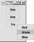
Because the pop-up menu is triggered by mouse events, we need to register a MouseListener for any of the components to which it applies. In this example, all three buttons and the content pane of the frame are eligible for the color pop-up menu. Therefore, we add a mouse event listener for all these components explicitly. The same instance of an anonymous inner MouseAdapter subclass is used in each case. In this class, we override the mousePressed(), mouse-Released(), and mouseClicked() methods to display the pop-up menu when we get an appropriate event. How do we know what an "appropriate event" is? Fortunately, we don't need to worry about the specifics of our user's platform; we just need to call the event's isPopupTrigger() method. If this method returns true, we know the user has done whatever normally displays a pop-up menu on his system.
Once we know that the user wants to raise a pop-up menu, we display the pop-up menu by calling its show() method with the mouse event coordinates as arguments.
If we want to provide different menus for different types of components or the background, we create different mouse listeners for each different kind of component. The mouse listeners invoke different kinds of pop-up menus as appropriate.
The only thing left is to handle the action events from the pop-up menu items. We use a helper method called makeMenuItem() to register the PopUpColorMenu window as an action listener for every item we add. The example implements ActionListener and has the required actionPerformed() method. This method reads the action command from the event, which is equal to the selected menu item's label by default. It then sets the background color of the selected component appropriately.
We used JScrollPane earlier in this chapter without explaining much about it. In this section we'll remedy the situation.
A JScrollPane is a container that can hold one component. Said another way, a JScrollPane wraps another component. By default, if the wrapped component is larger than the JScrollPane itself, the JScrollPane supplies scrollbars. JScrollPane handles the events from the scrollbars and displays the appropriate portion of the contained component.
Technically, JScrollPane is a Container, but it's a funny one. It has its own layout manager, which can't be changed. It can accommodate only one component at a time. This seems like a big limitation, but it isn't. If you want to put a lot of stuff in a JScrollPane, just put your components into a JPanel, with whatever layout manager you like, and put that panel into the JScrollPane.
When you create a JScrollPane, you specify the conditions under which its scrollbars are displayed. This is called the scrollbar display policy; a separate policy is used for the horizontal and vertical scrollbars. The following constants can be used to specify the policy for each of the scrollbars:
Displays a scrollbar only if the wrapped component doesn't fit.
Always shows a scrollbar, regardless of the contained component's size.
Never shows a scrollbar, even if the contained component won't fit. If you use this policy, you should provide some other way to manipulate the JScrollPane.
By default, the policies are HORIZONTAL_SCROLLBAR_AS_NEEDED and VERTICAL_SCROLLBAR_AS_NEEDED.
Support for scrolling with mouse wheels is automatic as of JDK 1.4. You do not have to do anything explicit in your application to get this to work.
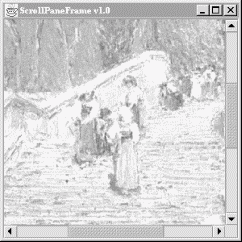
The following example uses a JScrollPane to display a large image (see Figure 16-9). The application itself is very simple; all we do is place the image in a JLabel, wrap a JScrollPane around it, and put the JScrollPane in a JFrame's content pane.
Here's the code:
//file: ScrollPaneFrame.java
import java.awt.*;
import java.awt.event.*;
import javax.swing.*;

public class ScrollPaneFrame
{
  public static void main(String[] args) {
    String filename = "Piazza di Spagna.jpg";
    if (args.length > 0)
      filename = args[0];

    JFrame frame = new JFrame("ScrollPaneFrame v1.0");
    JLabel image = new JLabel( new ImageIcon(filename) );
    frame.getContentPane(  ).add( new JScrollPane(image) );

    frame.setSize(300, 300);
    frame.setDefaultCloseOperation( JFrame.EXIT_ON_CLOSE );
    frame.setVisible(true);
  }
}
To hold the image we have used a JLabel and ImageIcon. The ImageIcon class pre-loads the image using a MediaTracker and determines its dimensions. It's also possible to have the ImageIcon show the image as it loads or to ask it for information on the status of loading the image. We'll discuss image observers in Chapter 20.
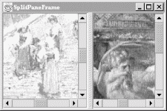
A split pane is a special container that holds two components, each in its own subpane. A splitter bar adjusts the sizes of the two subpanes. In a document viewer, you could use a split pane to show a table of contents next to a full document.
The following example uses two JLabels containing ImageIcons, like the previous example. It displays the two labels, wrapped in JScrollPanes, on either side of a JSplitPane (see Figure 16-10). You can drag the splitter bar back and forth to adjust the sizes of the two contained components.
//file: SplitPaneFrame.java
import java.awt.*;
import java.awt.event.*;
import javax.swing.*;
import javax.swing.border.*;

public class SplitPaneFrame {
  public static void main(String[] args) {
    String fileOne = "Piazza di Spagna.jpg";
    String fileTwo = "L1-Light.jpg";
    if (args.length > 0) fileOne = args[0];
    if (args.length > 1) fileTwo = args[1];

    JFrame frame = new JFrame("SplitPaneFrame");

    JLabel leftImage = new JLabel( new ImageIcon( fileOne ) );
    Component left = new JScrollPane(leftImage);
    JLabel rightImage = new JLabel( new ImageIcon( fileTwo ) );
    Component right = new JScrollPane(rightImage);

    JSplitPane split =
      new JSplitPane(JSplitPane.HORIZONTAL_SPLIT, left, right);
    split.setDividerLocation(100);
    frame.getContentPane(  ).add(split);

    frame.setDefaultCloseOperation( JFrame.EXIT_ON_CLOSE );
    frame.setSize(300, 200);
    frame.setVisible(true);
  }
}
If you've ever dealt with the Control Panel in Windows, you already know what a JTabbedPane is. It's a container with labeled tabs. When you click on a tab, a new set of controls is shown in the body of the JTabbedPane. In Swing, JTabbedPane is simply a specialized container.
Each tab has a name. To add a tab to the JTabbedPane, simply call addTab(). You'll need to specify the name of the tab as well as a component that supplies the tab's contents. Typically, it's a container holding other components.
Even though the JTabbedPane only shows one set of components at a time, be aware that all the components on all the pages are in memory at one time. If you have components that hog processor time or memory, try to put them into some "sleep" state when they are not showing.
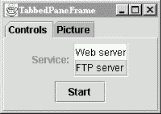
The following example shows how to create a JTabbedPane. It adds standard Swing components to a tab named Controls. The second tab is filled with a scrollable image, which was presented in the previous examples.
//file: TabbedPaneFrame.java
import java.awt.*;
import java.awt.event.*;
import javax.swing.*;
import javax.swing.border.*;

public class TabbedPaneFrame {
  public static void main(String[] args)
  {
    JFrame frame = new JFrame("TabbedPaneFrame");
    JTabbedPane tabby = new JTabbedPane(  );

    // create the controls pane
    JPanel controls = new JPanel(  );
    controls.add(new JLabel("Service:"));
    JList list = new JList(
        new String[] { "Web server", "FTP server" });
    list.setBorder(BorderFactory.createEtchedBorder(  ));
    controls.add(list);
    controls.add(new JButton("Start"));

    // create an image pane
    String filename = "Piazza di Spagna.jpg";
    JLabel image = new JLabel( new ImageIcon(filename) );
    JComponent picture = new JScrollPane(image);
    tabby.addTab("Controls", controls);
    tabby.addTab("Picture", picture);

    frame.getContentPane(  ).add(tabby);

    frame.setSize(200, 200);
    frame.setDefaultCloseOperation( JFrame.EXIT_ON_CLOSE );
    frame.setVisible(true);
  }
}
The code isn't especially fancy, but the result is an impressive-looking user interface. The first tab is a JPanel that contains some other components, including a JList with an etched border. The second tab simply contains the JLabel with ImageIcon wrapped in a JScrollPane. The running example is shown in Figure 16-11.
Our example has only two tabs, and they fit quite easily, but in a realistic application it is easy to run out of room. By default, when there are too many tabs to display in a single row, JTabbedPane automatically wraps them into additional rows. This behavior fits with the tab notion quite well, giving the appearance of a filing cabinet, but it also necessitates that when you select a tab from the back row, the tabs must be rearranged to bring the selected tab to the foreground. Many users find this confusing, and it violates a principal of user interface design that says that controls should remain in the same location. Alternatively the tabbed pane can be configured to use a single, scrolling row of tabs by specifying a scrolling tab layout policy like this:
setTabLayoutPolicy( JTabbedPane.SCROLL_TAB_LAYOUT );
JScrollPane is such a handy component that you may not ever need to use scrollbars by themselves. In fact, if you ever do find yourself using a scrollbar by itself, chances are you really want to use another component called a slider.
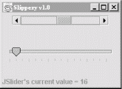
There's not much point in describing the appearance and functionality of scrollbars and sliders. Instead, let's jump right in with an example that includes both components. Figure 16-12 shows a simple example with both a scrollbar and a slider.
Here is the source code for this example:
//file: Slippery.java
import java.awt.*;
import java.awt.event.*;
import javax.swing.*;
import javax.swing.event.*;

public class Slippery {
  public static void main(String[] args)
  {
    JFrame frame = new JFrame("Slippery v1.0");
    Container content = frame.getContentPane(  );

    JPanel main = new JPanel(new GridLayout(2, 1));
    JPanel scrollBarPanel = new JPanel(  );
    final JScrollBar scrollBar =
        new JScrollBar(JScrollBar.HORIZONTAL, 0, 48, 0, 255);
    int height = scrollBar.getPreferredSize(  ).height;
    scrollBar.setPreferredSize(new Dimension(175, height));
    scrollBarPanel.add(scrollBar);
    main.add(scrollBarPanel);

    JPanel sliderPanel = new JPanel(  );
    final JSlider slider =
        new JSlider(JSlider.HORIZONTAL, 0, 255, 128);
    slider.setMajorTickSpacing(48);
    slider.setMinorTickSpacing(16);
    slider.setPaintTicks(true);
    sliderPanel.add(slider);
    main.add(sliderPanel);

    content.add(main, BorderLayout.CENTER);

    final JLabel statusLabel =
        new JLabel("Welcome to Slippery v1.0");
    content.add(statusLabel, BorderLayout.SOUTH);

    // wire up the event handlers
    scrollBar.addAdjustmentListener(new AdjustmentListener(  ) {
      public void adjustmentValueChanged(AdjustmentEvent e) {
        statusLabel.setText("JScrollBar's current value = "
                            + scrollBar.getValue(  ));
      }
    });

    slider.addChangeListener(new ChangeListener(  ) {
      public void stateChanged(ChangeEvent e) {
        statusLabel.setText("JSlider's current value = "
                            + slider.getValue(  ));
      }
    });

    frame.pack(  );
    frame.setDefaultCloseOperation( JFrame.EXIT_ON_CLOSE );
    frame.setVisible(true);
  }
}
All we've really done here is added a JScrollBar and a JSlider to our main window. If the user adjusts either of these components, the current value of the component is displayed in a JLabel at the bottom of the window.
The JScrollBar and JSlider are both created by specifying an orientation, either HORIZONTAL or VERTICAL. You can also specify the minimum and maximum values for the components, as well as the initial value. The JScrollBar supports one additional parameter, the extent. The extent simply refers to what range of values is represented by the slider within the scroll bar. For example, in a scrollbar that runs from 0 to 255, an extent of 128 means that the slider will be half the width of the scrollable area of the scrollbar.
JSlider supports the idea of tick marks, lines drawn at certain values along the slider's length. Major tick marks are slightly larger than minor tick marks. To draw tick marks, just specify an interval for major and minor tick marks, and then paint the tick marks:
slider.setMajorTickSpacing(48);
    slider.setMinorTickSpacing(16);
    slider.setPaintTicks(true);
JSlider also supports labeling the ticks with text strings, using the setLabelTable() method.
Responding to events from the two components is straightforward. The JScrollBar sends out AdjustmentEvents every time something happens; the JSlider fires off ChangeEvents when its value changes. In our simple example, we display the new value of the changed component in the JLabel at the bottom of the window.
A dialog is another standard feature of user interfaces. Dialogs are frequently used to present information to the user ("Your fruit salad is ready.") or to ask a question ("Shall I bring the car around?"). Dialogs are used so commonly in GUI applications that Swing includes a handy set of prebuilt dialogs. These are accessible from static methods in the JOptionPane class. Many variations are possible; JOptionPane groups them into four basic types:
Displays a message to the user, usually accompanied by an OK button.
Ask a question and displays answer buttons, usually Yes, No, and Cancel.
Asks the user to type in a string.
The most general type; you pass it your own components, which are displayed in the dialog.
A confirmation dialog is shown in Figure 16-13.

Let's look at examples of each kind of dialog. The following code produces a message dialog:
JOptionPane.showMessageDialog(f, "You have mail.");
The first parameter to showMessageDialog() is the parent component (in this case f, an existing JFrame). The dialog will be centered on the parent component. If you pass null for the parent component, the dialog is centered in your screen. The dialogs that JOptionPane displays are modal, which means they block other input to your application while they are showing.
Here's a slightly fancier message dialog. We've specified a title for the dialog and a message type, which affects the icon that is displayed:
JOptionPane.showMessageDialog(f, "You are low on memory.",
        "Apocalyptic message", JOptionPane.WARNING_MESSAGE);
Here's how to display the confirmation dialog shown in Figure 16-13:
int result = JOptionPane.showConfirmDialog(null,
        "Do you want to remove Windows now?");
In this case, we've passed null for the parent component. Special values are returned from showConfirmDialog() to indicate which button was pressed. There's a full example below that shows how to use this return value.
Sometimes you need to ask the user to type some input. The following code puts up a dialog requesting the user's name:
String name = JOptionPane.showInputDialog(null,
        "Please enter your name.");
Whatever the user types is returned as a String or null if the user presses the Cancel button.
The most general type of dialog is the option dialog. You supply an array of objects you wish to be displayed; JOptionPane takes care of formatting them and displaying the dialog. The following example displays a text label, a JTextField , and a JPasswordField. (Text components are described in the next chapter.)
JTextField userField = new JTextField( );
JPasswordField passField = new JPasswordField( );
String message = "Please enter your user name and password.";
result = JOptionPane.showOptionDialog(f,
    new Object[] { message, userField, passField },
    "Login", JOptionPane.OK_CANCEL_OPTION,
    JOptionPane.QUESTION_MESSAGE,
    null, null, null);
We've also specified a dialog title ("Login") in the call to showOptionDialog(). We want OK and Cancel buttons, so we pass OK_CANCEL_OPTION as the dialog type. The QUESTION_MESSAGE argument indicates we'd like to see the question-mark icon. The last three items are optional: an Icon, an array of different choices, and a current selection. Since the icon parameter is null, a default is used. If the array of choices and the current selection parameters were not null, JOptionPane might try to display the choices in a list or combo box.
The following application includes all the examples we've covered:
import javax.swing.*;

public class ExerciseOptions {
  public static void main(String[] args) {
    JFrame frame = new JFrame("ExerciseOptions v1.0");
    frame.setSize(200, 200);
    frame.setVisible(true);

    JOptionPane.showMessageDialog(frame, "You have mail.");
    JOptionPane.showMessageDialog(frame, "You are low on memory.",
        "Apocalyptic message", JOptionPane.WARNING_MESSAGE);

    int result = JOptionPane.showConfirmDialog(null,
        "Do you want to remove Windows now?");
    switch (result) {
      case JOptionPane.YES_OPTION:
        System.out.println("Yes"); break;
      case JOptionPane.NO_OPTION:
        System.out.println("No"); break;
      case JOptionPane.CANCEL_OPTION:
        System.out.println("Cancel"); break;
      case JOptionPane.CLOSED_OPTION:
        System.out.println("Closed"); break;
    }

    String name = JOptionPane.showInputDialog(null,
        "Please enter your name.");
    System.out.println(name);

    JTextField userField = new JTextField( );
    JPasswordField passField = new JPasswordField( );
    String message = "Please enter your user name and password.";
    result = JOptionPane.showOptionDialog(frame,
        new Object[] { message, userField, passField },
        "Login", JOptionPane.OK_CANCEL_OPTION,
        JOptionPane.QUESTION_MESSAGE,
        null, null, null);
    if (result == JOptionPane.OK_OPTION)
      System.out.println(userField.getText( ) +
          " " +  new String(passField.getPassword( )));

    System.exit(0);
  }
}
A JFileChooser is a standard file-selection box. As with other Swing components, JFileChooser is implemented in pure Java, so it looks and acts the same on different platforms.
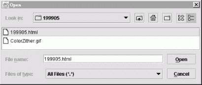
Selecting files all day can be pretty boring without a greater purpose, so we'll exercise the JFileChooser in a minieditor application. Editor provides a text area in which we can load and work with files. (The JFileChooser created by Editor is shown in Figure 16-14.) We'll stop just shy of the capability to save and let you fill in the blanks (with a few caveats).
Here's the code:
import java.awt.*;
import java.awt.event.*;
import java.io.*;
import javax.swing.*;

public class Editor extends JFrame implements ActionListener
{
  private JEditorPane textPane = new JEditorPane( );

  public Editor( ) {
    super("Editor v1.0");
    Container content = getContentPane( );
    content.add(new JScrollPane(textPane), BorderLayout.CENTER);
    JMenu menu = new JMenu("File");
    menu.add(makeMenuItem("Open"));
    menu.add(makeMenuItem("Save"));
    menu.add(makeMenuItem("Quit"));
    JMenuBar menuBar = new JMenuBar( );
    menuBar.add(menu);
    setJMenuBar(menuBar);
    setSize(300, 300);
setDefaultCloseOperation( JFrame.EXIT_ON_CLOSE );
  }

  public void actionPerformed(ActionEvent e) {
    String command = e.getActionCommand( );
    if (command.equals("Quit")) System.exit(0);
    else if (command.equals("Open")) loadFile( );
    else if (command.equals("Save")) saveFile( );
  }

  private void loadFile ( ) {
    JFileChooser chooser = new JFileChooser( );
    int result = chooser.showOpenDialog(this);
    if (result == JFileChooser.CANCEL_OPTION) return;
    try {
      File file = chooser.getSelectedFile( );
      java.net.URL url = file.toURL( );
      textPane.setPage(url);
    }
    catch (Exception e) {
      textPane.setText("Could not load file: " + e);
    }
  }

  private void saveFile( ) {
    JFileChooser chooser = new JFileChooser( );
    chooser.showSaveDialog(this);
    // Save file data...
  }

  private JMenuItem makeMenuItem( String name ) {
    JMenuItem m = new JMenuItem( name );
    m.addActionListener( this );
    return m;
  }

  public static void main(String[] s) {
new Editor(  ).setVisible(true);
  }
}
Editor is a JFrame that lays itself out with a JEditorPane (which is covered in Chapter 17) and a pull-down menu. From the pull-down File menu, we can Open, Save, or Quit. The actionPerformed() method catches the events associated with these menu selections and takes the appropriate action.
The interesting parts of Editor are the private methods loadFile() and saveFile(). The loadFile() method creates a new JFileChooser and calls its showOpenDialog() method.
A JFileChooser does its work when the showOpenDialog() method is called. This method blocks the caller until the dialog completes its job, at which time the file chooser disappears. After that, we can retrieve the designated file with the getFile() method. In loadFile(), we convert the selected File to a URL and pass it to the JEditorPane, which displays the selected file. As you'll learn in the next chapter, JEditorPane can display HTML and RTF files.
You can fill out the unfinished saveFile() method if you wish, but it would be prudent to add the standard safety precautions. For example, you could use one of the confirmation dialogs we just looked at to prompt the user before overwriting an existing file.
Swing is chock full of goodies. JColorChooser is yet another ready-made dialog supplied with Swing; it allows your users to choose colors. The following very brief example shows how easy it is to use JColorChooser:
import java.awt.*;
import java.awt.event.*;
import javax.swing.*;

public class LocalColor {
  public static void main(String[] args) {
    final JFrame frame = new JFrame("LocalColor v1.0");
    final Container content = frame.getContentPane( );
    content.setLayout(new GridBagLayout( ));
    JButton button = new JButton("Change color...");
    content.add(button);

    button.addActionListener(new ActionListener( ) {
      public void actionPerformed(ActionEvent e) {
        Color c = JColorChooser.showDialog(frame,
            "Choose a color", content.getBackground( ));
        if (c != null) content.setBackground(c);
      }
    });

    frame.setSize(200, 200);
    frame.setDefaultCloseOperation( JFrame.EXIT_ON_CLOSE );
    frame.setVisible(true);
  }
}
This example shows a frame window with a single button. When you click on the button, a color chooser pops up. After you select a color, it becomes the background color of the frame window.
Basically all we have to do is call JColorChooser's static method showDialog(). In this example, we specified a parent component, a dialog title, and an initial color value. But you can get away with just specifying a parent component. Whatever color the user chooses is returned; if the user presses the Cancel button, null is returned.
| CONTENTS |