|
|
|
7.1 Basic IntegrationTo build components that exploit Visual Studio .NET's integration facilities, you must understand the basic mechanisms involved. Component integration relies heavily on the .NET runtime's reflection mechanismthe facility that allows type information to be examined at runtime. VS.NET uses reflection to discover what properties and events your component provides.
One of the advantages of this reflection-based approach is that components get a great deal for free. All of their public properties and events will be detected automatically. So a component as simple as that shown in Example 7-1 can participate fully in visual editing in a Visual Studio .NET project. Example 7-1. A very simple componentusing System.ComponentModel;
public class MyComponent : Component
{
public string Title
{
get { return myTitle; }
set { myTitle = value; }
}
private string myTitle;
}
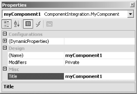
If you compile the code in Example 7-1 into a class library, you can drag the compiled DLL from Windows Explorer onto a toolbox. (Alternatively, you can add it by right-clicking on the toolbox, selecting Customize Toolbox..., choosing the .NET Framework Components tab, clicking the Browse... button, and locating your component. This will have the same effect but is considerably more long-winded than the drag-and-drop approach.) When you add a DLL to a toolbox, Visual Studio .NET searches it for classes that implement System.ComponentModel.IComponent and will add an entry to the toolbox for each such class that it finds. This includes all classes that derive from ComponentModelit implements IComponent. If the DLL just contains the class shown in Example 7-1, the toolbox will grow one extra entry, as shown in Figure 7-1. (The cog icon is the default graphic used when a component does not provide its own bitmap. We will see how to supply a custom bitmap later.) Figure 7-1. A newly added toolbox itemYou will now be able to drag this component onto Visual Studio .NET design windows just like any other component. Because it derives directly from Component (and not the Windows Forms or Web Forms Control classes), it will appear in the component tray of any form you add it to, rather than on the form itself. This makes perfect sensewe didn't write a visual component, so it would have no business appearing on the form itself. Once you have added an instance of your component to the component tray, you can select it and edit its properties by displaying the Properties window, just as you can for any built-in component. Figure 7-2 shows the Properties window for this component. Figure 7-2. A custom component in the Properties window Notice that the one public property defined by our classTitlehas appeared in the Properties window, along with the standard pseudo properties that the designer always adds. (The (Name) entry simply determines the name of the designer-generated field that will hold a reference to the component. Note that if you add a property called Name, this can lead to confusion, as VS.NET tends to want the Name property to be the same as the name of the field that holds the object. The Modifiers property determines that field's protection level.) If the component has any public events, and you are using it in a C# project, the lightning bolt button will appear at the top of the window, allowing us to browse the events instead of the properties. (For a Visual Basic .NET project, the events will instead be listed at the top of the source editor window.) Our property has appeared in the default Misc category, but we will see how to change that shortly.
This reflection-based designer integration is great because it requires no effort to get a component working in Visual Studio .NET. However, this is all pretty bare-bones stuff. Even for an extremely simple component such as the one in Example 7-1, we are missing basic features, such as property categorization and description. Fortunately, .NET's reflection mechanism is extensibletypes and their members can be annotated with custom attributes. Visual Studio .NET exploits this extensibility, and many of its integration features can be harnessed simply by adding the right attributes to your components. |
|
|
|