 |  |

The pack Geometry Manager
The grid Geometry Manager
The place Geometry Manager
The form Geometry Manager
Geometry Management Summary
To display widgets on the screen, they must be passed to a geometry manager. The geometry manager controls the position and size of the widgets in the display window. Several geometry managers are available with Perl/Tk: pack, place, grid, and form.
All the geometry managers are invoked as methods on the widget, but they all have their own methodologies and arguments to change where and how the widgets are put on the screen:
$widget1->pack(); $widget2->place(); $widget3->grid(); $widget4->form( );
When you organize the widgets in your window, it is often necessary to separate groups of widgets to get a certain look and feel. For instance, when you use pack, it is difficult to have widgets stacked both horizontally and vertically without grouping them in some fashion. We use a Frame widget or another window (a Toplevel widget) to group widgets inside a window.
We create our first window by calling MainWindow. The MainWindow is a special form of a Toplevel widget. For more detailed information on how to create/configure Frame and Toplevel widgets, see Chapter 11, " Frame, MainWindow,and Toplevel Widgets".
With the exception of place, differences between the geometry managers make it difficult (not entirely impossible, but definitely not recommended) to use more than one geometry manager within the same area. In $mw, we can display many types of widgets, but if we start using pack, we should continue to use pack on all the widgets contained directly in $mw. Don't switch to grid in the middle, because the two geometry managers will get into a race condition: one will create its layout, which affects the geometry calculations of the other, which affects the layout of the first, causing it to recompute its geometries, ad infinitum. However, let's assume our MainWindow contains a Frame, which in turn contains other widgets. We could use pack to pack the Frame inside the MainWindow and then we could use grid to manage the widgets inside the Frame. See Figure 2-1.
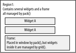
Although the different geometry managers have their own strengths and weaknesses, pack is the most commonly used, so we'll discuss it first and in the most detail. The grid geometry manager has been improved greatly with the release of Tk 8.0 and subsequent porting to Perl. The place geometry manager is the most tedious to use, because you have to determine exact coordinates (relative or absolute) for every single widget. Finally, the form geometry manager is like a combination of pack and place.
Remember when you were a child and you had those wooden puzzles to put together? Each piece in the puzzle had exactly one place where it could go and there weren't any overlaps allowed between pieces.
With the pack geometry manager, our windows are similar to the wooden puzzle, because widgets cannot overlap or cover each other, partially or completely (see Figure 2-2). If a Button is packed in a certain space on the window, the next Button (or any widget) will have to fit around the already packed Button. Luckily, our windows will be dealing only with rectangular shapes instead of funny-shaped puzzle pieces.
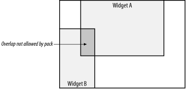
The order in which you pack your widgets is very important because it directly affects what you see on the screen. Each Frame or Toplevel maintains a list of items that are displayed within it. This list has an order to it: if widget A is packed before widget B, then widget A will get preference if space becomes scarce. This will become clear as we go through some examples. You will often get a different look to your window just by packing the widgets in a different order.
If you don't care what the window looks like and how the widgets are put in it, you can use pack with no arguments and skip the rest of this chapter. Here it is again:
$widget->pack( );
To make your window look nicer and more manageable (and user friendly), there are arguments that can be sent to the pack method that will change the way the widgets and the window look. As with anything in Perl/Tk, the arguments are arranged in key/value pairs. So the more sophisticated usage would be:
$widget->pack( [ option => value, ... ] );
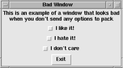
Here is the code to create a window that doesn't use any pack options. We haven't covered all the widgets used in this example, but hang in there; it's pretty simple.
#!/usr/bin/perl -w
use Tk;

my $mw = MainWindow->new;
$mw->title("Bad Window");
$mw->Label(-text => "This is an example of a window that looks bad\nwhen you don't
 send any options to pack")->pack;

$mw->Checkbutton(-text => "I like it!")->pack;
$mw->Checkbutton(-text => "I hate it!")->pack;
$mw->Checkbutton(-text => "I don't care")->pack;
$mw->Button(-text => "Exit",
            -command => sub { exit })->pack;
MainLoop;
Figure 2-3 shows the resulting window.
We can alter the preceding code and add some options to the pack calls that will make our window look much nicer:
#!/usr/bin/perl -w
use Tk;

my $mw = MainWindow->new;
$mw->title("Good Window");
$mw->Label(-text => "This window looks much more organized, and less haphazard\n" .
    "because we used some options to make it look nice")->pack;

$mw->Button(-text => "Exit",
            -command => sub { exit })->pack(-side => 'bottom',
                                            -expand => 1,
                                            -fill => 'x');
$mw->Checkbutton(-text => "I like it!")->pack(-side => 'left',
                                              -expand => 1);
$mw->Checkbutton(-text => "I hate it!")->pack(-side => 'left',
                                              -expand => 1);
$mw->Checkbutton(-text => "I don't care")->pack(-side => 'left',
                                                -expand => 1);
MainLoop;
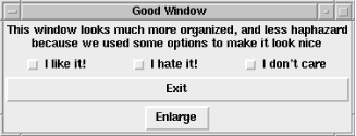
Figure 2-4 shows the much more organized window.

Using pack allows you to control the:
Position in the window relative to the window or Frame edges
Size of widgets, relative to other widgets or absolute
Spacing between widgets
Position in the window's or Frame's widget list
The options, values, and defaults are listed and discussed in the following section.
This list shows all the options available when you call pack (the default values are shown in bold):
Each window (or Frame) has four sides to it: top, bottom, left, and right. The packer uses these sides as points of reference for widgets. By default, pack places the widgets against the top of the Toplevel or Frame.
You can control the side a widget is placed against with the -side option:
-side => 'left' | 'right' | 'top' | 'bottom'
For example, if we would like our Button against the left edge of the window, we can specify -side => 'left'.
Using our Hello World example as a base, let's look at what happens when we pack our Button against the different sides. In Figure 2-5, the only lines we change are the ->pack part of the Button creation line and the "Hello World" string in the $mw->title command to easily show the new options to pack.
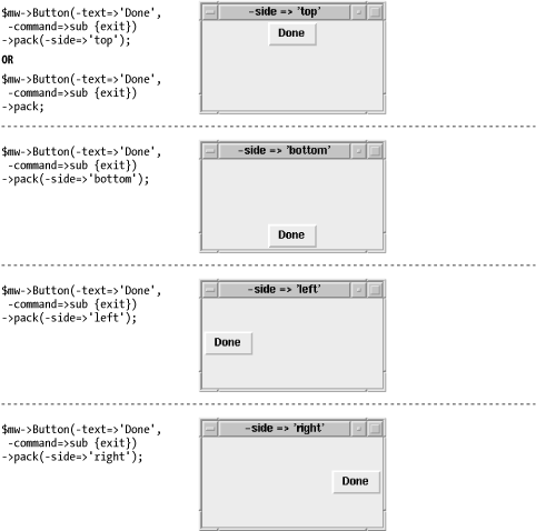
The windows in Figure 2-5 have been made a bit larger to emphasize the difference that using alternative values for -side makes. Normally, the window will be only as large as required to show the Button. When you are deciding how to place widgets in a window, it is always a good idea to see what happens when you make the window both larger and smaller. Make sure the behavior you get is what you want.
So far, pack seems pretty simple, but what if you want to put more than one Button in your application? What happens when we add more Buttons?
$mw->Button(-text => 'Done1', -command => sub { exit })->pack;
$mw->Button(-text => 'Done2', -command => sub { exit })->pack;
$mw->Button(-text => 'Done3', -command => sub { exit })->pack;
$mw->Button(-text => 'Done4', -command => sub { exit })->pack;
Since the default -side is top, we would expect all the Buttons to be mushed up against the top of the window, right? Sort of. The packer allocates space for each widget, then manipulates the widget inside that space and the space inside the window.
Figure 2-6 shows what the window with the four Done Buttons looks like; the next section explains why.

When given an item to pack, the packer first looks to see which side (top, bottom, right, or left) to use. It then sets aside an invisible rectangular area across the length of that side for use only by that widget.
In Figure 2-7, the solid-line rectangle represents our empty window (or Frame), and the dotted-line rectangle is the area the packer sets aside for the first Button. It actually does go all the way across the width or height of the window, but to make it easier to see, it's shown indented slightly.

The dimensions for the dotted-line box, which we'll call the allocation rectangle, are calculated based on the size of the requesting widget. For both the top and bottom sides, the allocation rectangle is as wide as the window and only as tall as the widget to be placed in it. For the right and left sides, the allocation rectangle is as tall as the window but only as wide as required to fit the widget.
Our examples so far have used Buttons in which the text of the Button determines its width. If we create a Button with the text "Done" and one with the text "Done, Finished, That's it," the second Button is going to be much wider than the first. When these two Buttons are placed up against either the right or left side of the window, the second Button has a wider allocation rectangle than the first. If we place those same two Buttons against the top and the bottom, the allocation rectangles are the same height and width, because the window, not the widget, determines the width.
After the size of the allocation rectangle is determined, the widget is placed within the allocation rectangle according to other options passed and/or the default values of those options. We will go over those options and how they can affect the allocation rectangle later.
Once the first widget has been placed in the window, the amount of area available for subsequent allocation rectangles is smaller, because the first allocation rectangle has used some of the space (see Figure 2-8).
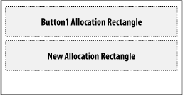
When more Buttons are placed against different sides in the same window, the results will vary depending on the order.
We'll start by placing one Button along the top, one along the bottom, and then Buttons on the right and left:
$mw->Button(-text => "TOP", -command => sub { exit })
   ->pack(-side => 'top');

$mw->Button(-text => "BOTTOM", -command => sub { exit })
   ->pack(-side => 'bottom');

$mw->Button(-text => "RIGHT", -command => sub { exit })
   ->pack(-side => 'right');

$mw->Button(-text => "LEFT", -command => sub { exit })
  ->pack(-side => 'left');
Figure 2-9 shows the allocation rectangles for this window.
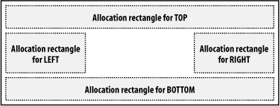
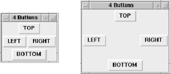
Figure 2-10 shows what the actual window looks like, both normal size and resized so it's a bit larger.
Normally, the widget is left at the default size, which is usually smaller than the allocation rectangle created for it. If the -fill option is used, the widget will resize itself to fill the allocation rectangle according to the value given. The possible values are:
-fill => 'none' | 'x' | 'y' | 'both'
Using the value 'x' will resize the widget in the x direction. Likewise, 'y' will cause the widget to resize in the y direction. Using -fill => 'both' is a good way to see exactly what size and placement was given to the allocation rectangle, because 'both' resizes the widget in both x and y directions. Using our four-Button example again, we'll specify -fill => 'both':
$mw->Button(-text => "TOP", -command => sub { exit })
  ->pack(-side => 'top', -fill => 'both');

$mw->Button(-text => "BOTTOM", -command => sub { exit })
  ->pack(-side => 'bottom', -fill => 'both');

$mw->Button(-text => "RIGHT", -command => sub { exit })
  ->pack(-side => 'right', -fill => 'both');

$mw->Button(-text => "LEFT", -command => sub { exit })
  ->pack(-side => 'left', -fill => 'both');
Figure 2-11 shows the resulting window.
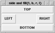
If we switch the Button we create first, we get a different result. The window in Figure 2-12 was created by packing the widgets in this order: left, right, top, bottom.
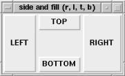
Figure 2-13 demonstrates yet another order, which really shows that the allocation rectangles change size depending on which is packed first.
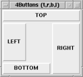
A common use of -fill is on widgets with Scrollbars: Listbox, Canvas, and Text. Usually the Scrollbars are along the edge of the window and you want the Listbox to fill the remaining area. See Chapter 6, "The Scrollbar Widget" and Chapter 7, "The Listbox Widget" for more information.
The -expand option manipulates the allocation rectangle and not the widget inside it. The value associated with -expand is a Boolean value.
-expand => 1 | 0
Given a true value, the allocation rectangle will expand into any leftover space in the window, depending on which side the widget was packed.
Widgets packed with side 'right' or 'left' will expand in the horizontal direction. Widgets packed with side 'top' or 'bottom' will expand in the vertical direction. If more than one widget is packed with -expand turned on, the extra space in the window is divided evenly among all the allocation rectangles that want it.
In Figure 2-11 and Figure 2-12, you saw that there was some space left in the center of the window that wasn't occupied by any widget. If we change the code and add -expand => 1 to the list of pack options for each Button, the result is the window in Figure 2-14.
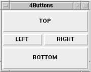
Note that in Figure 2-14, fill => 'both' is left in the code. If we omit the -fill option, the Buttons stay their original sizes, but the allocation rectangles (which are invisible) take over the extra space in the window (see Figure 2-15).
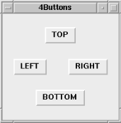
In Figure 2-15, the Buttons are centered in their allocation rectangles because of the default value of the -anchor option, which is 'center'.
The -anchor option manipulates the widget inside the allocation rectangle by anchoring it to the place indicated by the value passed in. It uses the points of a compass as references.
-anchor => 'e' | 'w' | 'n' | 's' | 'ne' | 'nw' | 'se' | 'sw' | 'center'
Figure 2-16 shows those locations in an example allocation rectangle.
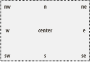
The default for -anchor is 'center', which keeps the widget in the center of its allocation rectangle. Unless the -expand option is set to a true value, this won't seem to change much of anything in the window. As seen in Figure 2-17, which shows the result of using the -expand => 1 option, it is obvious that the widget sticks to that center position when the window is resized.
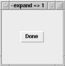
If all other defaults are used to pack the widget, Figure 2-18 shows what -anchor => 'e' and -anchor => 'w' do.

Remember that the allocation rectangle is created based on which side the widget is packed against, so certain combinations will appear not to have had any effect. For example:
$mw->Button(-text => "Done", -command => sub { exit })
  ->pack(-side => 'top', -anchor => 'n');
This code fragment will leave the widget exactly where it was if the -anchor option had not been specified, because the allocation rectangle does not change size at all. If the -expand option is also specified, when the window is resized, the widget sticks to the north side of the window. If -anchor => 's' is specified, when the window is resized, the widget sticks to the south side of the window.
The -anchor option is more often used to line up several widgets in a row. Figure 2-19 and Figure 2-20 show two common examples.


Sometimes when -side and -anchor are used together, the results don't seem to be what you would expect at first glance. Always keep in mind that invisible allocation rectangle and how it affects what you see on the screen.
Each window into which widgets are packed keeps track of those widgets in an ordered list. The order of this list is determined by the order in which the widgets were packed; the last item packed is the last item in the list. Using the -after option, you can change the default order by specifying which widget should be placed after your new widget. On the opposite end, if you use the -before option, you can put the new widget before a previously packed widget:
-after => $otherwidget
-before => $otherwidget
As an example, let's create four Buttons ($widget1, $widget2, $widget3, and $widget4) and only pack three to begin with. The pack command for $widget4 might then be:
$widget4->pack(-after => $widget1);
Figure 2-21 shows two windows: one before $widget4 is packed and one after $widget4 is packed.
If we want to put $widget4 in front of $widget1, we use this command:
$widget4->pack(-before => $widget1);
Figure 2-22 shows the results.
The final way to force pack to size the widget is to use the padding options. The first set of padding options affects the widget itself by adding to its default size. Different amounts can be added in the x and y directions, or they can be the same. To specify how much padding should occur in the x direction, use the -ipadx option:
-ipadx => amount
Specify padding for the y direction like this:
-ipady => amount
The amount is a number that is a valid screen distance. We'll discuss the definition of a valid screen distance in the next section.
Both the -ipadx and -ipady options change the size of the widget before the allocation rectangle is calculated. -ipadx adds the amount specified to both the right and left sides of the widget. The overall width of the widget is increased by 2 x amount. -ipady adds to the top and bottom of the widget, causing the overall height of the widget to increase by 2x amount. Figure 2-23 shows how the -ipadx and -ipady options affect a Button.

The other kind of padding is inserted between the edge of the widget and the edge of the allocation rectangle and is done with the -padx and -pady options:
-padx => amount
-pady => amount
Using -padx and -pady does not affect the size of the widget, but it does affect the size of the allocation rectangle. It acts as a buffer around the widget, protecting it from touching other widgets. Figure 2-24 shows the effects of using -padx and -pady.

A good way to remember the difference between -ipadx/y and -padx/y is that the "i" stands for "inside the widget" or "internal padding."
Many times you'll see options that require values specified in screen units (or what is called a valid screen distance). The options -ipadx and -ipady are examples of this type of option. Always check to see what value the option actually requires.
A screen unit is a number followed by a designation for the unit to use. If there is no designation, the units are in pixels. Table 2-1 shows all the possibilities.
|
Designator |
Meaning |
Examples |
|---|---|---|
|
(None) |
Pixels (default) |
20, 30, "20", "40" |
|
Centimeters |
'3c', '4c', "3c" |
|
|
i |
Inches |
'2i', "3i" |
|
m |
Millimeters |
'4m', "4m" |
|
p |
Printer points (1/72 inch) |
"72p", '40p' |
To use these designators, it is necessary to use quotes (either single or double) around the value. Here are some examples:
$button->pack(-ipadx => 20);      # 20 pixels
$button->pack(-ipadx => '20');    # Also 20 pixels
$button->pack(-ipadx => "1i");    # 1 inch
$button->pack(-ipadx => '1m');    # 1 millimeter
$button->pack(-ipadx => 1);       # 1 pixel
$button->pack(-ipadx => "20p");   # 20 printer points
Remember that a p designator does not stand for pixels, but printer points.
By default, when a widget is packed, it is packed inside the region that created it. Sometimes it is necessary to display a widget inside a different region. Use the -in option to do so:
-in => $otherwindow
It puts the new widget at the end of the packing order for $otherwindow and displays it accordingly. All other options specified in the pack call still apply.
There are a few methods that are used in conjunction with the pack geometry manager. They allow the programmer to get information about either the widget that has been packed or the parent widget in which other widgets are packed.
To unpack a widget from a window or Frame, use the packForget method:
$widget->packForget( );
packForget makes it look like the widget disappears. The widget is not destroyed, but it is no longer managed by pack. The widget is removed from the packing order, so if it's repacked later, it appears at the end of the packing order.
To return a list containing all the pack configuration information about a widget, use packInfo:
@list = $widget->packInfo( );
The format of the list is in option/value pairs. The first pair in the list is -in and the current window that contains $widget (usually also the parent). Here's an example of the information returned from packInfo:
-in MainWindow=HASH(0x818dcf4) -anchor n -expand 0 -fill none -ipadx 0 -ipady 0 -padx
10 -pady 10 -side left
From this we can tell that we packed our $widget into the MainWindow rather than into a Frame. Since the list has a "paired" quality to it, we could easily store the result from packInfo in a hash and reference the different option values by using a key to the hash:
%packinfo = $widget->packInfo;
print "Side used: ", $packinfo{-side}, "\n";Unless you've set a preferred window size via the geometry method explicitly, when you put a widget inside a window, the window (or Frame) will resize itself to accommodate the widget. If you are placing widgets inside your window dynamically while the program is running, the window will appear to bounce from size to size. You can turn this behavior off by using packPropagate on the Frame or Toplevel widget:
$widget->packPropagate(0);
If set to 0 or 'off', packPropagate changes the behavior of the widget so it doesn't resize to accommodate items packed inside of it. When a false value is sent to packPropagate before widgets are placed inside it, this automatic resizing doesn't happen, so you can't see any of the widgets placed inside the parent until it is manually resized. If you call packPropagate after the widgets have been placed inside it, the widget will ignore any size changes from its child widgets.
You can determine the widgets your Frame or Toplevel holds with the packSlaves method:
@list = $parentwidget->packSlaves( );
packSlaves returns an ordered list of all the widgets that were packed into $parentwidget. An empty string (or empty list) is returned if no widgets were packed into $parentwidget.
The list returned from packSlaves looks like this:
Tk::Button=HASH(0x81b2970) Tk::Button=HASH(0x8116ccc) Tk::Button=HASH(0x81bcdd4)
Each item is a reference to a packed widget and can be used to configure it. For example, you can increase the size of each widget by 20 in both the x and y directions by looping through it and "packing" it with new information. Using our good window example in Figure 2-4, we can add a Button that will contain a subroutine that uses packSlaves:
$mw->Button(-text => "Enlarge",
            -command => \&repack_kids)->pack(-side => 'bottom',
                                             -anchor => 'center');
sub repack_kids {
  my @kids = $mw->packSlaves;
  foreach (@kids) {
    $_->pack(-ipadx => 20, -ipady => 20);
  }
}
Figure 2-25 shows the resulting window.
Let's look at what happens when we press the Enlarge Button. As shown in Figure 2-26, all the widgets are now repacked with additional parameters of -ipadx => 20, -ipady => 20. These new options are in addition to any other parameters with which the widgets were packed previously. If an option is repeated, the last one specified overrides the previous ones.
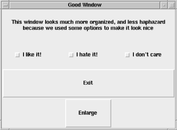
The window is suddenly huge! Subsequent presses of the Enlarge Button will do nothing more to the window, because each of the widgets already has an -ipadx and -ipady of 20. If we wanted to always add 20 to the values of -ipadx and -ipady, we would have to request the current values and add 20 to them:
sub repack_kids {
  my @kids = $mw->packSlaves;
  foreach (@kids) {
    %packinfo = $_->packInfo( );
    $_->pack(-ipadx => 20 + $packinfo{"-ipadx"},
             -ipady => 20 + $packinfo{"-ipady"});
  }
}
We use packInfo to get the current configuration and add 20 to that value.
Here are three little programs that let you experiment with the packing options of an unspecified number of widgets.
As you can see in Figure 2-27, there is both a console window and an "output" window that show what is happening to widgets as you change their options. The complete code follows shortly.
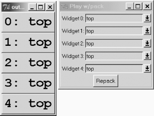
There are a lot of widgets and methods in the code that we haven't covered yet. For now, it would be useful to download the code, run it, and play around with the options.
use Tk;
require Tk::BrowseEntry;

if ($#ARGV >= 0) { $numWidgets = $ARGV[0]; }
else { $numWidgets = 4; }

$mw = MainWindow->new(-title => "Play w/pack");
$f = $mw->Frame(-borderwidth => 2, -relief => 'groove')
	->pack(-side => 'top', -fill => 'x');
my (@packdirs) = ( );

$i = 0;
foreach (0..$numWidgets)
{
	$packdirs[$_] = 'top';
	my $be = $f->BrowseEntry(-label => "Widget $_:",
		-choices => ["right", "left", "top", "bottom"],
		-variable => \$packdirs[$_], -browsecmd => \&repack)
		->pack(-ipady => 5);
}

$f->Button(-text => "Repack", -command => \&repack )
	->pack(-anchor => 'center');

# use a separate window so we can see what the output
# looks like without clutter.
$top = $mw->Toplevel(-title => "output window");
my $c;
foreach (@packdirs)
{
	my $b = $top->Button(-text => $c++ . ": $_",
		-font => "Courier 20 bold")
		->pack(-side => $_, -fill => 'both', -expand => 1);
}

MainLoop;

sub repack
{
	@w = $top->packSlaves;
	foreach (@w) { $_->packForget; }
	my $e = 0;
	foreach (@w)
	{
		$_->configure(-text => "$e: $packdirs[$e]");
		$_->pack(-side => $packdirs[$e++], -fill => 'both', -expand => 1)	;
	}
}
A more complicated version of our pack demo lets us alter not just the side the widget is packed against but the more commonly used pack options:
use Tk;
require Tk::BrowseEntry;

if ($#ARGV >= 0) { 	$numWidgets = $ARGV[0]; }
else { 	$numWidgets = 1; }

$mw = MainWindow->new(-title => "Play w/pack");

$f = $mw->Frame(-borderwidth => 2, -relief => 'groove')
	->pack(-side => 'top', -fill => 'x');

# Initialize the variables
my (@packdirs) = ( );
my (@anchordirs) = ( );
my (@fill) = ( );
my (@expand) = ( );

$i = 0;
$top = $mw->Toplevel(-title => "output window");
my $addbutton = $f->Button(-text => "Add Widget",
	-command => \&addwidget )->pack(-anchor => 'center');

foreach (0..$numWidgets) {
	my $b = $top->Button(-text => $_ . ": $packdirs[$_]")->pack;
	my %pinfo = $b->packInfo;
	$b->packForget;
	&addwidget($_);
}
MainLoop;

sub repack {
	print "Repacking...";
	@w = $top->packSlaves;
	foreach (@w) { $_->packForget; }
	my $e = 0;
	foreach (@w) 	{
		$_->configure(-text => "$e: $packdirs[$e]");
		print "Expand is : " . $expand[$e]. "\n";
		$_->pack(-side => $packdirs[$e],
						 -fill => $fill[$e],
						 -expand => $expand[$e],
						 -anchor => $anchordirs[$e]);
		$e++;
	}
}

sub addwidget {
	my ($count) = @_;
	print "COUNT $count\n";
	if (! defined $count) 	{
		$numWidgets ++;
		$count = $numWidgets ;
	}

	$packdirs[$count] = 'top';
	$anchordirs[$count] = 'center';
	$fill[$count] = 'none';
	$expand[$count] = 0;

	my $f1 = $f->Frame->pack(-side => 'top', -expand => 1,
		-fill =>'y', -before => $addbutton);
	my $be = $f1->BrowseEntry(-label => "Widget $count:",
		-choices => ["right", "left", "top", "bottom"],
		-variable => \$packdirs[$count], -browsecmd => \&repack)
		->pack(-ipady => 5, -side => 'left');

	$f1->BrowseEntry(-label => "-anchor",
		-choices => [qw/center n s e w ne se nw sw/],
		-variable => \$anchordirs[$count], -browsecmd => \&repack)
		->pack(-ipady => 5, -side => 'left');

	$f1->BrowseEntry(-label => "-fill", -choices => [qw/none x y both/],
		-variable => \$fill[$count], -browsecmd => \&repack)
		->pack(-ipady => 5, -side => 'left');

	$f1->Checkbutton(-text => "-expand", -onvalue => 1, -offvalue => 0,
		-variable => \$expand[$count], -command => \&repack)
		->pack(-ipady => 5, -side => 'left');

	$top->Button(-text => $count . ": $packdirs[$count]",
		-font => "Courier 20 bold")->pack(-side => $packdirs[$count],
		-fill => $fill[$count], -expand => $expand[$count]);
}
Figure 2-28 shows what the new console looks like (the output window looks the same until you vary the options).

This sample switches packed widgets between a visible and invisible state. As the widgets are created, save their references as the array @w. The scalar $packed is associated with the Checkbutton. Whenever we click the Checkbutton, the value of $packed toggles between 1 and 0. The first click of the Checkbutton sets $packed to 0 and invokes the -command callback. For more information on callbacks, see Chapter 15, "Anatomy of the MainLoop".
The callback then removes the widgets from the display, using packInfo to fetch their pack attributes, which are stored in an instance variable. Refer to Chapter 14, "Creating Custom Widgets in Pure Perl/Tk" for details on instance variables. When restoring widgets, the callback uses the saved pack information to exactly replicate the initial packing configuration.
my $f = $mw->Frame->pack;
my $packed = 1;

push  my @w, $f->Label(-text => "l1")->pack(-side => "bottom"),
  $f->Button(-text => "l2")->pack(-side => "right"),
  $f->Label(-text => "l3")->pack(-side => "top"),
  $f->Button(-text => "l4")->pack(-side => "left"),
;
$mw->Checkbutton(-text => "Pack/Unpack",
		 -variable => \$packed,
		 -command => sub {
		     if ($packed) {
			 foreach (@w) {
			     $_->pack(@{ $_->{PackInfo} });
			 }
		     } else {
			 foreach (@w) {
			     $_->{PackInfo} = [ $_->packInfo ];
			     $_->packForget;
			 }
		     }
		 })->pack;
Copyright © 2002 O'Reilly & Associates. All rights reserved.